Engineered geometric typefaces
I love these two related typefaces by Klim Type Foundry: Metric and Calibre.
Metric & Calibre are a pair of typefaces that share a fundamental geometry yet differ in the finish of key letterforms. Metric is a geometric humanist, sired by West Berlin street signs. Calibre is a geometric neo-grotesque, inspired by the rationality of Aldo Novarese’s seldom seen Recta. They were conceived as a pair but function independently of each other.
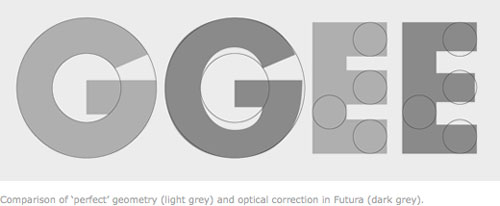
The development of Metric & Calibre is based upon two ideas-1: “engineered geometry” and it’s application to street signage, 2: alternate letterforms in typefaces.
(via df)
Stay Connected